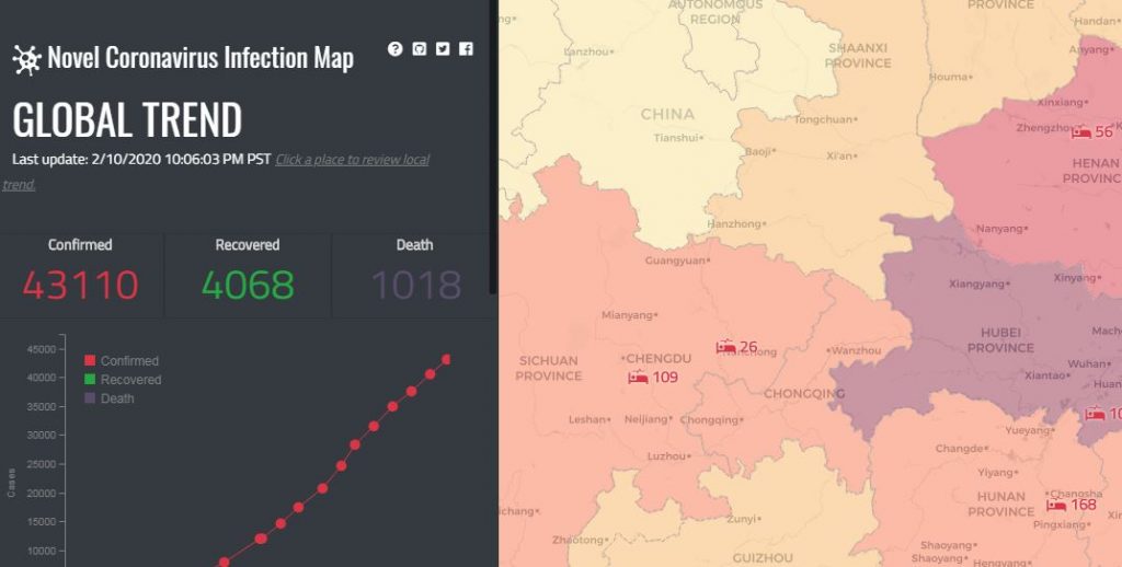
Washington: Scientists in the US have developed an interactive map of the novel coronavirus spread, that allows users to see the number of cases worldwide, recoveries and deaths, as well as trends in real time.
The map updates every few hours with data from the US Centres for Disease Control and Prevention, the World Health Organization (WHO), Chinese and other government agencies, including those in Hong Kong, Macau and Taiwan.
“Mapping is a powerful tool to tell social, cultural and political phenomena,” said Bo Zhao, an assistant professor at the University of Washington in the US.
“As a geographer, and in what people call the ‘post-truth era,’ it’s important to weigh in with data sources to show people how things are happening,” Zhao said.
By zooming in on various countries — such as China — users can see the number of cases, recoveries and deaths, as well as trends over time, according to the researchers.
The outbreak of the coronavirus, which is believed to have originated in Wuhan, China in December, has been declared a public health emergency by the WHO.
Tens of thousands have been infected, and hundreds have died so far.
Zhao recently produced an online atlas to illustrate the global refugee experience. The coronavirus, he said, is another societal issue that people can gain perspective on by seeing it on a map.
According to Zhao, while the Chinese government has been criticised for its response to the crisis, and concerns have arisen about its transparency, China’s National Health Commission data is the most accurate available for the country.
However, the outbreak is not just affecting China or the city of Wuhan, he added.
“It is a global issue, and that’s the perspective users can gain from the map. The numbers on display are important, too, because there are more recoveries than deaths,” Zhao said.
“That can give people encouragement,” he said.
PTI
